1950–1967[]
1967–1973[]
This can marked the first appearance of the all-uppercased "PEPSI" text (which was used on the standalone logo at the time).
1973-1987[]
The can was redesigned in 1973, changing to a white background, with the Pepsi name written differently. (The standard logo has a different version of the text.) The logo was repeated three times on the can with a rectangle extending downward. The "Pepsi" name was seen twice (with a red rectangle on one copy and no rectangle on the other copy), the "Pepsi-Cola" name was seen once (with a blue rectangle).
In 1974, the Pepsi globe began to look crooked, compared to the one in the standard logo, and was more closer to the Pepsi name. Four years later, the three rectangles remained in red.
1987-1991[]
The label looked the same as before, with the only difference being that the Pepsi name is written in ITC Handel Gothic, the font used on the "Choice of a New Generation" tagline at the end of their commercials.
This marked the final time the "Pepsi-Cola" name was in use until the 2014 launch of Pepsi made with Real Sugar.
1989-1991[]
Same as last time, except the Pepsi globe and name were refreshed to look exactly like the standard logo.
1991–1997[]
On October 8, 1991, the logos for all six Pepsi products was redesigned; the Pepsi name removed from the globe and on its own spot, rotated vertically and now written the same way, but in italics. (Pepsi would be known for this version of their all-uppercase name until 2008.) The red rectangle was smaller, and the two sides of the globe are moved downward, leaving a white, curvy strip.
The new look was not announced in marketing until 1992, where, in a commercial featuring Cindy Crawford, the announcer says, "Introducing a whole new way to look at Pepsi and Diet Pepsi."
In 1995, a Christmas promotion saw the emerge of a blue background, the current color background Pepsi has today.
In 1996, as part of a second Christmas promotion, the Pepsi globe was in CGI, looking like the globe from the "Nothing Else Is A Pepsi" commercials.
1997–2003[]
In 1997, the Pepsi name and the background swapped colors, dropping the red rectangle. The Pepsi globe is in CGI, remaining the same size as it did last time.
Later in the year of 1998, the Pepsi logo got bigger in size.
2003–2008[]
On August 1st 2003, the entire Pepsi logo is rotated. The Pepsi name is reverted back to a square "E", the globe has more CGI, and in the background is shooting blue sticks. Near the "12 FL OZ" disclaimer is a copied Pepsi name, but smaller.
Two versions of the standard logo are used; one looking exactly like the one on this can, the other with the Pepsi name and globe swapped.
2008–2009[]
The next permanent redesign featured a smaller Pepsi globe, and a smaller Pepsi name, fitting the width of the globe. This occurred as part of a promotion for the summer (along with a new product called Summer Mix). This arrangement does not happen on the labels of Caffeine Free Pepsi or Wild Cherry Pepsi.
June 2009–2014[]
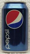
Both the Pepsi globe and typeface were redesigned, and the background became navy blue. The Pepsi globe was made to look like a smiling face, while the Pepsi name was written in all lowercase. This is repeated two times, and once more near the nutrition facts.
2014-2018; 2018-2023[]
Everything is shifted; the Pepsi globe is centered and the Pepsi name is bolded and written vertically.
In celebration of Fall Football 2017, the background is a football field with the Pepsi logo smaller in size and the NFL logo placed on the left panel.
Between January and August of 2018, this label was used in tandem with the next one.
January-August 2018[]
The modern logo was replaced for a limited time between January and August 2018 in favor of a tweaked, rounder version of the 1970s logo. During the label's first five months in use, it had the disclaimer, "Same Great Pepsi Taste, Retro Design".
2023-present[]


